What is a Billboard Poster?
A billboard poster is a new style of scientific poster that intends to simplify posters and make sharing information easier in a shorter amount of time. Also called better posters, or Posters 2.0, they distill the traditional information-dense poster into a few key components and focus on simplicity and readability.
Key Components
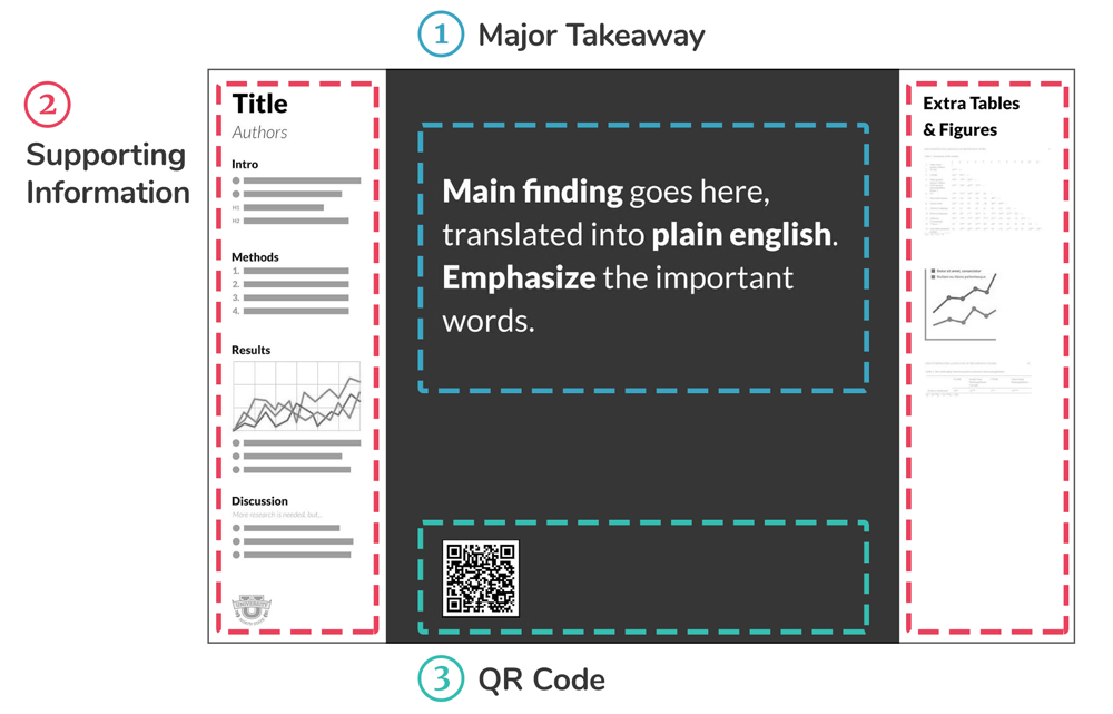
1Major Takeaway
A plain english takeaway with key phrases highlighted. Depending on your specific format and research, you may have multiple takeaways or top-level highlights.
See more: How to write a simplified title
2Supporting Information
An easily digestible explanation of your methods and results. Again, the format here is largely dependent on your specific research.
See more: How to create a silent presenter bar
3QR Code
Link to your research to be read later. You can also include contact details or other links to further reading in this section.
See more: How to use QR codes effectively
Here are some PowerPoint templates to get you started. Feel free to change the colors and layout as needed. These templates are within the PowerPoint page size limit of 56" and comes in several different aspect ratios, each of which can be printed in a number of sizes (as listed).
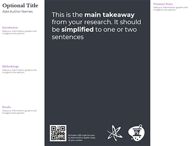
Billboard Template 1
The basic better poster template that includes a sidebar for presenter notes
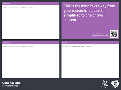
Billboard Template 2
Includes 3 large areas that are perfect for larger charts or graphics
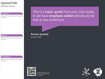
Billboard Template 3
A good template for case studies that formats the main takeaway as a quote
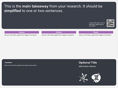
Billboard Template 4
A vertical take on the traditional better poster template
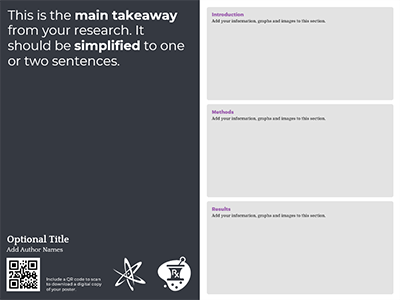
Billboard Template 5
Includes 3 large areas that are great for larger charts or graphics
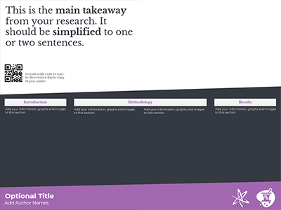
Billboard Template 6
A simple half-and-half template with lots of space for research details
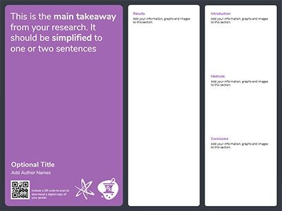
Billboard Template 7
Includes two sidebars that are great for quick points clear explanations
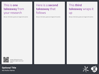
Billboard Template 8
This template includes 3 main takeaways that may suit different conclusions
History
The better poster template was pioneered by Mike Morrison at Michigan State Univeristy to simplify research posters. His method breaks a poster down into four sections to make understanding and retaining information easier at poster sessions. His main objective is to bring a better UX design to science so we can discover faster and fix the world sooner.
Since then, the template has adapted into a broader concept of posters that are easier to digest and understand quickly. At PosterNerd, we have developed some templates to fit this style and have made them free to use for anyone.
